

Mobile UX conversion is the process of optimizing a website’s layout, speed, navigation, and checkout flows on smartphone screens so that mobile visitors complete high-value actions—such as purchases, lead submissions, or sign-ups—at rates comparable to desktop users.
For SEO professionals and website owners, bridging the gap between mobile traffic volume and mobile conversion rate is critical: if search rankings drive smartphone users to pages that stall, shift, or demand excessive typing, acquisition budgets and organic visibility both suffer.
Despite mobile devices generating the majority of global web traffic, conversion rates on smartphones frequently lag behind desktop computers. This discrepancy rarely stems from a lack of user intent.
Instead, it is almost always caused by structural friction: cramped tap targets, intrusive interstitials, slow-loading scripts, and multi-step forms built for physical keyboards rather than thumbs.
Addressing these bottlenecks requires aligning technical SEO performance metrics with user-centered conversion rate optimization (CRO).
Why Mobile Traffic Still Underperforms Desktop in Conversions
Understanding the mobile conversion gap requires looking at how user context differs across devices. Desktop users typically browse on larger viewports with stable broadband connections, precise mouse pointers, and full keyboards.
Mobile users often navigate while multitasking, on variable cellular networks, using one-handed thumb gestures on screens roughly 360 to 430 pixels wide.
When a site relies on simple responsive scaling—shrinking desktop elements proportionally rather than rethinking the mobile experience—several predictable failure points emerge:
- Cognitive and Visual Overload: Multi-column grids stack vertically into endless scrolling corridors, pushing primary calls to action (CTAs) far below the initial viewport.
- Input Friction: Standard text fields, unoptimized date pickers, and multi-page checkout forms dramatically increase abandonment when users must type on small glass keyboards.
- Layout Instability: Late-loading advertisements, third-party chat widgets, and unreserved image containers cause elements to jump just as a user attempts to tap a button.
- Interruptive Pop-ups: Email capture modals and cookie banners that cover the entire mobile viewport block immediate content access and trigger rapid back-button exits.
From an SEO perspective, these usability failures do not remain isolated within analytics platforms. Search engines evaluate page experience signals and user engagement patterns.
When mobile visitors bounce quickly back to search results—a behavior known as pogo-sticking—it signals that the landing page failed to satisfy user expectations, putting long-term organic rankings at risk.
The SEO and Mobile UX Intersection: Core Web Vitals as Conversion Drivers
Technical SEO and conversion optimization converge directly in Google’s Core Web Vitals. While these metrics serve as page experience signals in search rankings, they also measure the exact performance thresholds that determine whether a mobile visitor stays or abandons a session, as outlined in Google’s Core Web Vitals documentation
| Core Web Vitals Metric | What It Measures | Recommended Threshold | Direct Impact on Mobile UX Conversion |
| Largest Contentful Paint (LCP) | Perceived loading speed of the main viewport content | 2.5 seconds or faster | Slow hero images or product photos cause impatient mobile users to abandon before seeing the value proposition. |
| Interaction to Next Paint (INP) | Visual responsiveness to user taps, clicks, and key presses | 200 milliseconds or faster | Laggy “Add to Cart” buttons or sluggish filter menus create doubt, leading users to tap repeatedly or leave. |
| Cumulative Layout Shift (CLS) | Visual stability of elements during page rendering | 0.1 or less | Shifting buttons cause accidental taps on ads or wrong links, destroying trust during checkout or navigation. |
Improving LCP on mobile requires prioritizing above-the-fold assets. Serve hero images in modern formats such as WebP or AVIF, apply fetchpriority="high" to the primary LCP image, and avoid lazy-loading elements visible in the initial viewport.
To optimize INP, audit third-party JavaScript tags—such as heatmaps, tag managers, and customer support widgets—that block the browser’s main thread. Defer non-critical scripts so that when a user taps a navigation menu or quantity selector, the interface responds instantaneously.
High-Impact Mobile UX Fixes That Drive Immediate Conversions
Once baseline technical speed and stability are established, conversion gains come from removing physical and cognitive friction across the user journey.
1. Design for the Thumb Zone and Ergonomic Reach
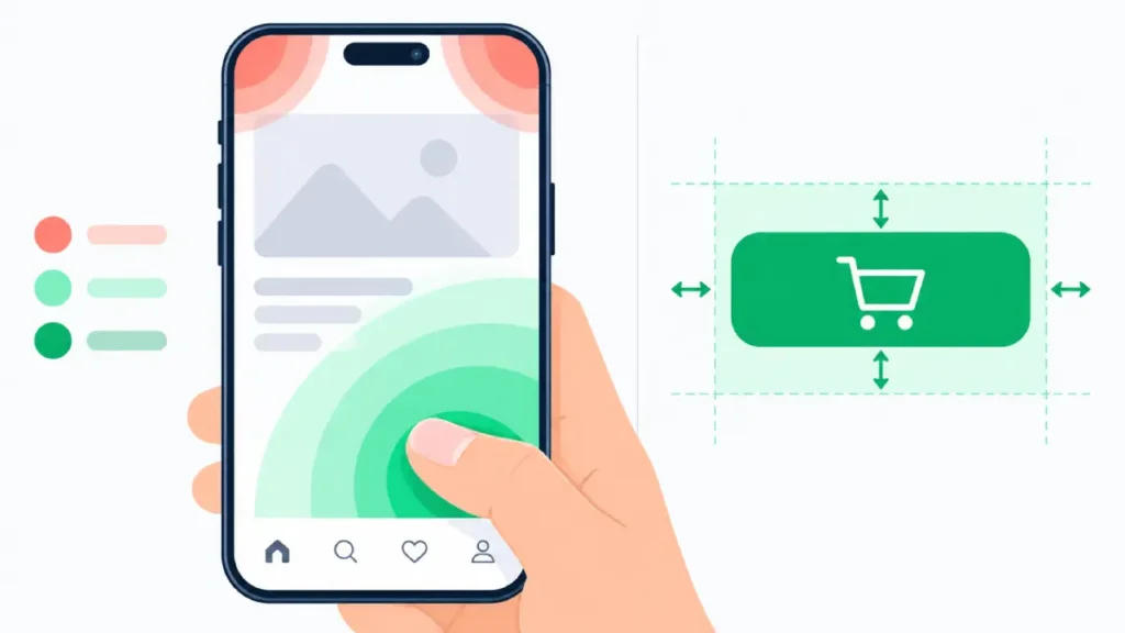
Most smartphone users hold their devices in one hand and navigate using their thumb. The center and lower-middle portions of the screen are the easiest areas to reach comfortably, whereas the top corners require stretching or shifting grip.
- Place primary CTAs—such as “Buy Now,” “Get a Quote,” or “Book Demo”—within easy thumb reach, utilizing a persistent sticky bottom bar on product and service pages where appropriate.
- Ensure all interactive tap targets measure at least 48 by 48 CSS pixels with adequate spacing (at least 8 pixels) between adjacent links or buttons to prevent mis-taps, following web.dev’s accessible tap target guidelines.
- Keep top navigation headers compact. Consolidate secondary links into a clean, accessible menu drawer while keeping search and cart icons immediately visible.
2. Streamline Mobile Navigation and On-Site Search
Mobile visitors rarely browse casually through deep category trees; they look for fast paths to specific answers or products.
- Elevate Site Search: Make the search bar prominent on mobile headers rather than hiding it behind a tiny magnifying glass icon, especially for e-commerce and content-heavy sites. Implement autocomplete with visual product thumbnails and typo tolerance.
- Simplify Filtering and Sorting: On category pages, use horizontal scrollable filter chips for top attributes (e.g., Price, Size, Rating) rather than forcing users into full-screen filter overlays for basic refinements.
- Use Breadcrumbs Wisely: Implement compact, horizontally scrollable breadcrumbs so users can step up one category level without hitting the browser back button repeatedly.
3. Eliminate Form and Checkout Friction
Forms represent the single steepest drop-off point in mobile conversion funnels. Every unnecessary field adds measurable friction on a touchscreen.
- Trigger Appropriate Virtual Keyboards: Use semantic HTML5 input types (
type="email",type="tel",inputmode="numeric") so smartphones automatically display the@symbol or numeric keypad instead of the standard QWERTY layout. - Enable Autofill and Address Autocomplete: Use standard
autocompleteattributes (name,street-address,postal-code) and integrate address lookup APIs so users can complete shipping details with one or two taps. - Offer Guest Checkout and Express Wallets: Never force account creation prior to purchase. Integrate one-tap mobile payment options—such as Apple Pay, Google Pay, or Shop Pay—which bypass manual credit card entry entirely.
- Inline Validation: Validate form fields in real time as the user moves to the next input, displaying clear, specific error messages directly beneath the field rather than resetting the form after submission.
4. Replace Intrusive Interstitials with Non-Blocking Prompts
Full-screen pop-ups triggered immediately upon landing on a mobile page degrade user experience and can negatively affect mobile search visibility under Google’s page experience and intrusive interstitial guidelines.
- Delay promotional sign-up prompts until the user has demonstrated engagement, such as scrolling 50% down the page or viewing a second page.
- Use compact, dismissible bottom banners or slide-in drawers that occupy less than 25% of the screen height and feature a clear, easily tappable close button.
- Ensure consent management platforms (cookie banners) load without blocking critical page rendering or obscuring primary navigation controls.
5. Optimize Mobile Content Scannability and Trust Signals
Smartphone users scan pages vertically in rapid bursts. Dense walls of text create immediate friction, particularly on informational landing pages and commercial service pages.
- Front-Load Value Propositions: Communicate what you offer, who it is for, and the primary benefit within the first mobile screenful before requiring any scrolling.
- Use Concise Paragraphs and Clear Subheadings: Keep paragraphs to two to four lines on mobile viewports. Use descriptive H2 and H3 headings, bullet lists, and comparison tables to structure key specifications.
- Surface Trust Signals Near CTAs: Place concise social proof—such as verified star ratings, review counts, security badges, or clear return policy summaries—directly adjacent to conversion buttons rather than burying them in the footer.
How to Audit Your Site’s Mobile UX Conversion Funnel
Before redesigning templates, conduct a structured diagnostic audit using behavioral and technical data to pinpoint exactly where mobile visitors drop off.
- Segment Analytics by Device Category: In your analytics platform, isolate mobile smartphone traffic from desktop and tablet traffic. Compare bounce rates, engagement rates, funnel step completion, and conversion rates across top organic landing pages. Identify high-traffic mobile pages with disproportionately low conversion rates.
- Analyze Mobile Page Experience Reports: Review field data in Google Search Console’s Core Web Vitals report specifically for mobile URLs. Prioritize template-level issues (such as product templates or blog templates) affecting large groups of pages.
- Review Session Recordings and Mobile Heatmaps: Watch anonymized mobile session replays for users who abandoned checkout or lead forms. Look for rage taps (repeated tapping on non-responsive elements), erratic scrolling, and horizontal overflow issues where content bleeds off the right edge of the screen.
- Test on Real Devices Across Network Conditions: Browser developer tools are useful for layout checks, but they do not replicate touch ergonomics or real-world CPU throttling. Test your top five organic landing pages and complete a full conversion path on both iOS and Android devices using a standard cellular connection.
Prioritizing Mobile UX Changes: An Impact vs. Effort Framework
SEO teams and site owners often face limited development bandwidth. Use the following prioritization matrix to sequence mobile UX improvements for maximum return on effort.
| Optimization Initiative | Expected Conversion Impact | Implementation Effort | Priority Level |
Add HTML5 input types (tel, email, numeric) and autocomplete attributes | Moderate to High | Low | Immediate Quick Win |
| Enable express mobile wallets (Apple Pay / Google Pay) | High | Low to Moderate | Immediate Quick Win |
| Eliminate full-screen entry pop-ups on mobile landing pages | Moderate to High | Low | Immediate Quick Win |
| Fix mobile CLS issues (reserve image/ad dimensions) | Moderate | Low to Moderate | High Priority |
| Implement sticky bottom CTA bar with 48px+ tap targets | Moderate to High | Moderate | High Priority |
| Reduce third-party JavaScript to improve mobile INP | Moderate to High | Moderate to High | Strategic Project |
| Redesign multi-step checkout into single-page accordion flow | High | High | Strategic Project |
Actionable Next Steps for SEO Professionals and Site Owners
Closing the mobile conversion gap does not require a complete site rebuild. Start by pulling a report of your top 10 organic landing pages sorted by mobile sessions, then compare their mobile conversion rates against desktop benchmarks.
Pick the single highest-traffic page with the widest conversion gap and walk through the conversion path on your own smartphone.
Fixing obvious input friction, stabilizing layout shifts, and placing clear calls to action within thumb reach will simultaneously protect your organic search visibility and capture revenue from the mobile audience you already earn.