
Key Takeaways
- Compute over Crawl Budget: Modern mobile-first indexing is constrained by Render Budget (Compute Seconds per Domain) rather than raw page fetch counts.
- The Hydration Gap: Client-Side Rendering (CSR) and delayed hydration create “hollow” DOM snapshots, hiding semantic content from Googlebot Smartphone.
- Semantic Parity: Collapsing UI elements (sidebars, author bios, internal links) for mobile viewports degrades your site’s position in Google’s Knowledge Graph.
Introduction: The Compute Economics of Mobile First Indexing
Mobile first indexing treats the smartphone version of your website as the primary version for indexing and ranking.
However, viewing Googlebot Smartphone as merely a mobile visitor is a dangerous oversimplification.
Googlebot Smartphone operates as a stateless, resource-constrained Headless Chromium instance.
Rendering JavaScript-heavy pages is computationally expensive costing up to 20x more compute power than fetching raw static HTML.
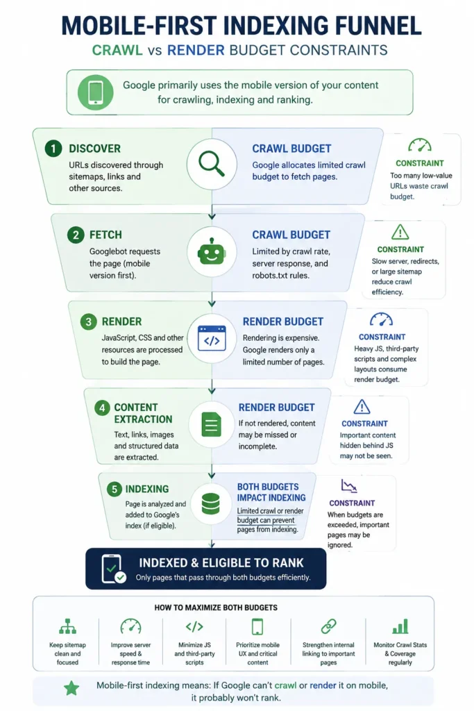
If your mobile site relies heavily on Client-Side Rendering (CSR), you consume more “Compute Seconds per Domain.”
When your site exhausts its allocated compute budget, Googlebot defers rendering, leaving new URLs in the “Crawled – currently not indexed” or “Discovered – currently not indexed” state.
When your site exhausts its allocated compute budget, Googlebot defers rendering, leaving new URLs in the ‘Crawled – currently not indexed’ or ‘Discovered – currently not indexed’ state.
To prevent secondary pages from stalling in this queue, apply an advanced keyword expansion framework that consolidates low-search-volume intent into primary rendering nodes.
1. The “2MB Cliff” & Front-Loaded Code Bloat
While Googlebot maintains a documented 15MB fetch cap, field analyses reveal a much tighter 2MB soft limit for the initial HTML parsing pass.
When mobile sites front-load excessive inline CSS, base64 images, or heavy tracking containers before the core body tag,
Googlebot’s parser may truncate the initial document before reading the main article or structured data.
Diagnostic Checklist for HTML Payload Optimization:
- Externalize Resources: Move heavy inline SVG icons and CSS blocks out of the raw HTML into external, cached assets.
- Deflate the
<head>: Audit Google Tag Manager containers and remove obsolete mobile scripts. - Verify Code-Splitting in Search Console: Use the URL Inspection Tool -> Test Live URL and inspect the raw HTML output. Verify that your bottom-of-page content, internal links, and structured data are visible in the rendered DOM.
2. Eliminating the “Hydration Gap” in JS Frameworks
The Hydration Gap occurs when a server delivers an initial HTML shell, but relies on client-side JavaScript to fetch or display primary text.
Googlebot Smartphone takes a snapshot at the equivalent of networkidle0. It does not wait indefinitely for client-side scripts to settle, nor does it simulate physical user interactions like tapping “Load More” or scrolling to fire AJAX events.
Mastering this timing requires understanding JavaScript page rendering mechanics to ensure critical DOM elements hydrate before the browser snapshot closes.
Raw DOM vs Server-Rendered HTML
The difference between an empty client-side shell and meaningful HTML delivered with the initial document response.
BAD · Hollow Client-Side Shell
Content depends on JavaScript execution
<!-- BAD: Hollow shell waiting for client-side JS -->
<div
  id="article-body"
  data-async-src="/api/v1/post-123"
></div>
The browser receives an empty container and must execute JavaScript and request additional data before the article content becomes available.
GOOD · Server-Rendered HTML
Meaningful content available immediately
<!-- GOOD: Server-rendered HTML available on initial fetch -->
<article id="article-body">
  <p>
    Primary article content rendered directly by SSR...
  </p>
</article>
The server returns meaningful article content immediately, reducing dependency on client-side JavaScript for the primary document structure.
Real-World Case Study: Infinite Scroll Crawl Trap
The Problem: An e-commerce site used JavaScript infinite scroll on category pages. The script generated paginated URLs (
?page=2) without properrel="canonical"tags or static fallback links.
The Result: Googlebot spent 80% of its render budget executing infinite JavaScript calls, leaving deep Product Detail Pages (PDPs) uncrawled.
The Solution: Implemented a static “View All” alternative for crawlers and blocked non-essential dynamic scroll parameters inrobots.txt.
3. Semantic Parity & The Shadow Content Audit
Semantic Parity ensures that entity signals, relational links, and structured data remain identical across desktop and mobile versions.
When responsive designs hide sidebars, author credentials, breadcrumbs, or tag clusters on mobile screens to save visual space, they unintentionally weaken the page’s topical footprint.
When responsive designs hide sidebars, author credentials, breadcrumbs, or tag clusters on mobile screens to save visual space, they unintentionally weaken the page’s topical footprint.
Furthermore, stripping cross-device links often leads to indexing split signals; managing duplicate content effectively through strict canonical mapping is required to unify mobile and desktop equity.
How Google Interprets Accessibility and Semantic Hierarchy
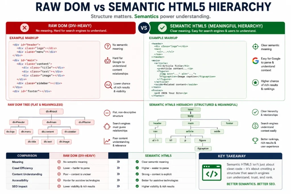
Googlebot Smartphone heavily relies on the Accessibility Tree to understand content hierarchy when visual cues (like desktop sidebars) are absent:
- Use Native HTML5 Structure: Replace generic
<div>wrappers with explicit semantic tags (<article>,<aside>,<section>,<dl>). - Avoid Visual-Only CSS Reordering: Using CSS
flex-direction: column-reverseororder: -1visually moves elements on screen, but Googlebot parses the source code order. Ensure your raw HTML matches your intended heading hierarchy (H1 -> H2 -> H3).
One Concept. One Explicit Relationship.
The HTML structure directly communicates the relationship between a concept and its definition.
- Crawl Budget
- The aggregate number of compute seconds and concurrent connections Googlebot allocates to a domain.
<dt>
Concept / Term
<dd>
Definition / Meaning
<!-- High Semantic Density Example -->
<dl>
  <dt>Crawl Budget</dt>

  <dd>
    The aggregate number of compute seconds and concurrent
    connections Googlebot allocates to a domain.
  </dd>
</dl>
4. Interaction to Next Paint (INP) on Mobile Devices
While Largest Contentful Paint (LCP) measures visual load speed, Interaction to Next Paint (INP) measures interface responsiveness. High INP scores directly correlate with increased mobile bounce rates.
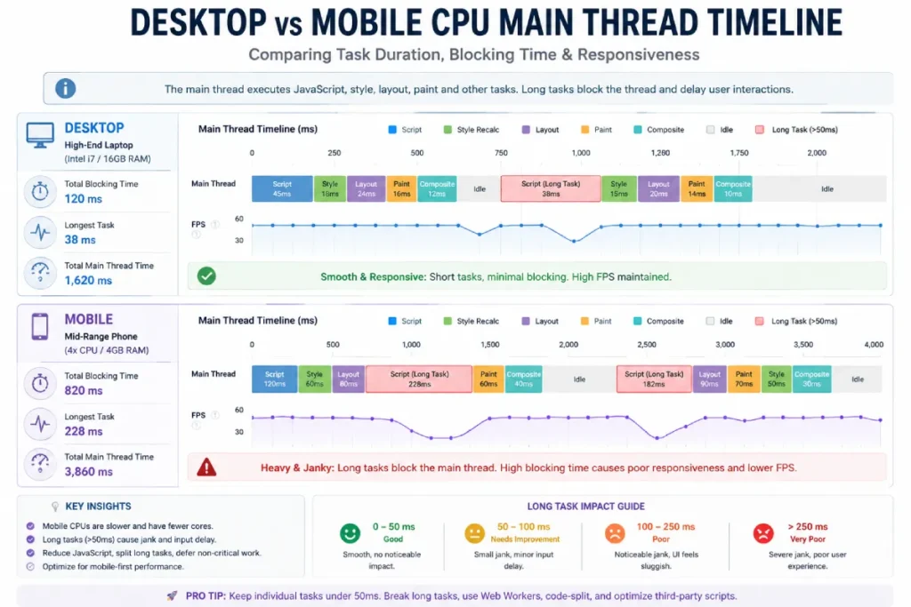
Mobile devices process JavaScript on significantly constrained hardware compared to desktop machines. Long tasks executing on the main thread block the browser from processing user taps or menu toggles.
The “Yield to Main” Strategy
To prevent main-thread blockage during page render, break down monolithic execution blocks using modern browser APIs like scheduler.yield() or setTimeout() task segmentation.
Breaking Up Long Tasks
Yielding control allows the browser to process user interactions between JavaScript tasks instead of keeping the main thread occupied.
// Breaking up long tasks to yield control back to the main thread
async function processLargeData(items) {
  for (let item of items) {
    processChunk(item);

    // Yield to let the browser process user input (taps, scrolls)
    if (typeof scheduler !== 'undefined'
        && scheduler.yield) {

      await scheduler.yield();
    }
  }
}
Large synchronous tasks can occupy the main thread and delay other browser work.
An awaited yield creates an opportunity for higher-priority browser work to run between chunks.
Breaking work into smaller pieces can reduce periods where interaction is blocked by JavaScript.
5. Mobile E-E-A-T & Knowledge Graph Alignment
On mobile devices, crucial trust signals are frequently pushed below the fold or removed entirely.
On mobile devices, crucial trust signals are frequently pushed below the fold or removed entirely. To sustain ranking stability in mobile SERPs, publishers must move beyond search volume to build semantic authority across interconnected entity clusters.
To maintain E-E-A-T signals under mobile-first indexing:
- Keep Author Credentials Visible: Ensure author bylines and expert review badges appear near the top of the mobile content body, not buried at the bottom of long scroll sequences.
- Mirror Schema Markup Exactly: JSON-LD structured data must be identical on desktop and mobile viewports. Differing schemas (e.g.,
Articleon mobile vs.NewsArticleon desktop) trigger entity conflict errors in Search Console. - Avoid Intrusive Interstitials: Full-screen pop-ups covering mobile main content trigger UX penalties. Replace full-screen modals with bottom sheets occupying less than 20% of the viewport height.
Summary Workflow: Fixing “Crawled – Currently Not Indexed”
- Audit Raw Mobile HTML: Run your page through the Search Console URL Inspector and confirm the main text and links exist within the initial fetch.
- Eliminate Render Blockers: Externalize CSS/JS, eliminate inline Base64 graphics, and trim your
<head>tag. - Enforce Absolute Parity: Verify that internal links, JSON-LD schema, and semantic tags match your desktop structure 1:1. Pay specific attention to your schema selection; selecting proper structured data for SEO content prevents schema conflict warnings in Google Search Console.
- Optimize Main-Thread Work: Defer non-critical third-party scripts to keep mobile INP under 200ms.